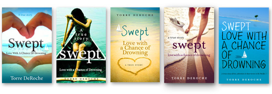
I need help choosing a book cover. All of my options are below.
But first, I want to tell you why I’m not good with decisions. In fact, I’m so bad at making decisions that it could be due to some sort of underlying medical condition, like scrambled eggs in place of a brain. It’s been that way for as long as I can remember.
Let me paint a picture of my indecision by taking you back to a school classroom, circa 1980-something. There’s me: six-years old, meticulously coloring an artwork with my tongue poking out to starboard (for added concentration). I feel an uncomfortable tugging in my abdomen, but I ignore the sensation because I’m consumed by what I love most: making art.
Suddenly, the source of the discomfort dawns on me with alarm.
I need to pee. I need to pee right now.
After an excruciating delay, I get the teacher’s permission to go to the bathroom.
Things are desperate now – extremely desperate – and I know I don’t have long, maybe a minute at most. My route-making from the classroom to the bathroom has to be the most direct, or else I’ll commit a primary school faux pas of the most humiliating proportions.
I have two route options:
Option one: Run down the hallway directly to the bathroom, which would breach the ‘No running in the hallway’ rule and put me at risk of getting stopped by an angry teacher. This route should take me around 26 seconds.
Option two: Run outside of the building, down the stairs, and around the classrooms, thus adding several precious footsteps to my journey. This route should take around 45 seconds.
I quickly mull over the pros and cons. Should I take the risk and go direct, or select the safer option at the expense of more time? This is possibly the most important decision of my six-year-old life. So here’s what I do:
Option three: Break into a dance called The Indecisive Shuffle, which goes a little something like this:
It’s just a jump to the left.
And then a step to the ri-i-i-ight.
Put your hands on your crotch.
You bring your knees in tight.
But it’s the running back and forth,
That really drives you in-sa-a-a-ane.
Let’s do The Shuffle again!
Let’s do The Shuffle again!
I perform The Indecisive Shuffle for about 60 seconds, possibly longer.
Finally, after I’ve finished dancing, I go outside, opting to run around the building to the bathroom.
Which, in retrospect, was the best decision, because if you’re going to pee your pants like I did that day, it’s really best done outside.
Please help me choose a book cover.
I have a book coming soon. It needs a cover. Covers on books are important. Important decisions make me shuffle (see above for dance steps). All my cover options are below, please let me know which one you like. Key info about Swept: Love with a Chance of Drowning for your information:
It’s a true love story that’s lighthearted, honest and raw. It’s mostly silly and fun, but occasionally it’s sad (some readers cry). While it takes place on a boat in the ocean, it’s not a sporty sailing book, dense with nautical lingo. While it involves travel and tropical destinations, it’s not a travelogue. It’s a character-focused journey about love, adventure, and fear. It’s targeted predominantly to women. Here’s the blurb and trailer.
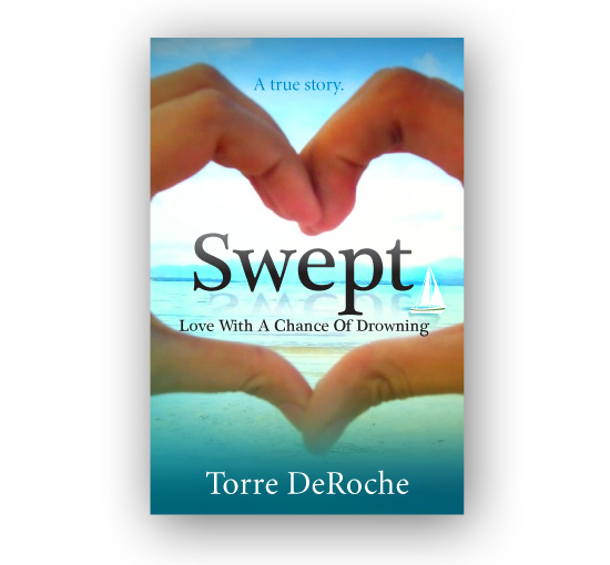
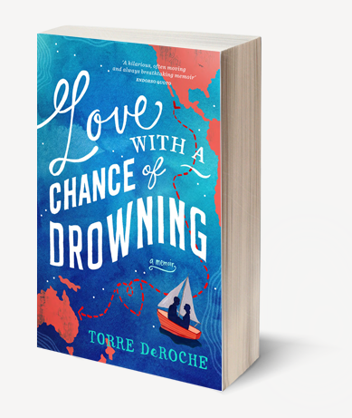
Option one: the cover I’m using in my current promotions.
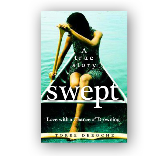
Option two: a girl in a boat.
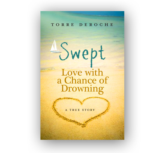
Option three: beachy, simple.
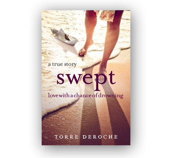
Option four: girl half in, half out of the water and fragile paper boat.
Option five: This may be a trick question to make sure you’re paying attention.
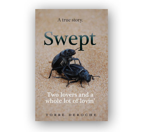
Option six: Light. Quirky. Beachy.
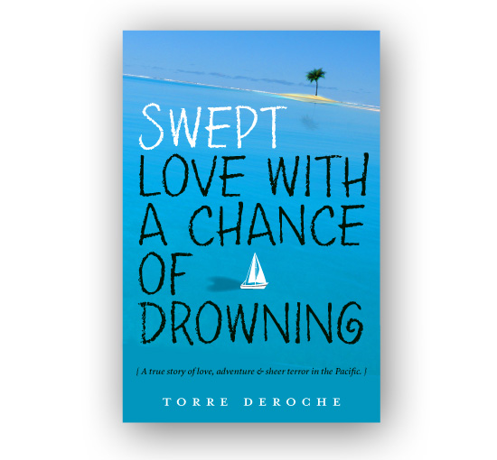
So tell me: do you have a preference? Or should we all just do The Indecisive Shuffle together?
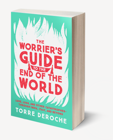
Torre DeRoche is the author of two travel memoirs, Love with a Chance of Drowning (2013) and The Worrier’s Guide to the End of the World (due out September 2017). She has written for The Atlantic, The Guardian Travel, The Sydney Morning Herald, Emirates, and two Lonely Planet anthologies.





115 Response Comments
Damn, it’s so hard because they are all good. I love the second one but- why is she in a canoe? I’m also drawn to the last one. Crap, I don’t know, I’m peeing my pants on this one.
Yes … why IS she in a canoe? Well, we did do a lot of rowboat rowing in our dinghy, Little Gracie. Hmm. Thanks, Kim.
I laughed so hard reading this story! I am so indecisive too, and I may or may not have peed my pants in primary school in a similar situation 🙂 I really like option one, but option three is also nice. Good luck with the choice! I hope your pants stay intact….
Thank you. I really hope the same for my pants, and maybe or maybe not yours too.
I choose Option one, it says it all and it has the right feeling and mood.
2nd choose is Option 6.
Good Luck and can’t wait to read it!
Thanks, Shelley. I can’t wait to share it with you.
I’m so bad at the decision thing too, but luckily for you, I’m much better at deciding other people’s lives than my own. But man this decision is HARD. All your covers are really great. I vote for the first one or the last one… probably because I like that color blue. But they are all really great.
Thank you. Yep, blue seems to be a winner.
I like the one you are using. It makes me thinkI am looking through a set of love shaped binoculars of into a very tempting place to be.
I do like the girl in the boat thing to, but that one seems to be a womens only market.
Sorry I gave 2 options.
Thanks, Melody. That’s a nice description.
Haha, No. 5 is kinda awesome, but I’d go with 1 or 6.
I can’t look at No. 5 without hearing porn-style slap-bass in my head. Thanks for your vote!
VOTES:
Isley: finger-heart
Flinders: sand-heart
Bree:
1. finger-heart
2. sand-heart
3. boat girl (this is my favourite image, but the first two match the mood more effectively)
4. paper boat (reminds me of Douglas Kennedy)
5. cute, playful
Thanks Bree, Isley and Flinders. xo
i think 1 and 3 look like feel good love story reads
2 looks the most adventurous, but maybe sad, like something tragic could happen, just going by the picture that is, not text
i think 4 looks again, like could be tragic, but has an epic love story look to it.
6 looks again more adventurous, and 5 conjurs all sorts of imagery
i’ve been no help, but those are the feeling i get when i look at each one, i like them all, all depends if you are targeting a particular audience. adventurers, romance lovers, or somewhere inbetween
This is very helpful, Wishy. I love ‘epic love story.’ I’ve definitely targeted somewhere in between love story and adventure, but not romance exactly.
As so many books are sold on the impression of a cover I think the ‘eye candy’ has to have maximum impact. So which impacts me the most? Truly, I’m taken with all of them. BUT, # 1 is my all time favorite – maybe I’m attached because I’ve been carrying this image for a long time and loved it the minute I first saw it. #2 is appealing but I don’t think has the same dynamic appeal as #1, ditto for #4. #3 is my second option and although #6 is pretty, it doesn’t have the same punch, interest grabbing impact for me.
Summary: 1, 3, 2, 4, 6
(secretly I love #5 too but you might save that for the parody after the story becomes universally famous)
I thought you’d like number 5.
Lovely story … option 4
Thanks, Carmen.
Option 2 and Option 4 are the most appealing to me. They’re beautiful but also just slightly gritty, interesting.
Oddly, I’m not as smitten with the pretty-pretty blue covers because they look a little TOO pretty. And there are lots of pretty-pretty blue covers out in Bookland. You don’t want yours to blend in.
Anyway, aren’t your publishers going to force a cover on you?
Thanks. “Gritty” and “interesting” are great words! I know what you mean about “too pretty” – that was my concern for cover 1. Is it too clean and centered and perfect? As for the publisher – they are very lenient. In fact, they’re so lenient that they let me do everything. More on that later. Thanks for your feedback!
I like 2 or 4 from an aesthetic point of view. I don’t think it matters that they feature a woman … I’m guessing this will be your biggest market. Even though you write like a man. 😉
Just because I say ‘balls’ a lot. Ha ha. Thanks, Karen.
I am interested in the story. As a guy, I probably wouldn’t take 1 and 3 on the train though…can’t wait to read.
Interesting … very interesting. Because it’s not chic lit, or exclusively female. I want men to feel comfortable reading it on the train!
My picks are 3 and 4! 🙂 I love them! 🙂
Cool. Thanks! The more feedback I get, the more I’m leaning towards 4.
Hey! So fun. I love No. 1, but I wonder whether that’s because I’d already seen it on your site. Don’t forget that for ebook sales, readers will see a tiny image of your cover — and that heart will still stand out.
Other thoughts:
#2 I like, but looks more haunted than lovey
#3 Also like, but kind of cliche
#4 Like, but not as good for ebook small display
#6 The only one I don’t care for — I much prefer the subtitle in small print
Can’t wait to see what you choose! You’ve done an awesome job, so you can’t go wrong either way 🙂
You’re right about it looking haunted. It could be a vampire story! Thanks for your feedback on this.
I particularly like the one of the paper boat… it’s really cute!
Thanks, the paper boat is becoming my favorite – I think it has the most meaning.
#4 is the most dynamic to me. On the others, the boat is just kind of sitting there clip-art style. In #4 the action of being “swept” seems imminent like “Holy shit, pick up that boat before that wave goes out!” It seems the most real and intense…kind of like you! (In a good way of course). The canoe lady is quite real as well but the canoe motif doesn’t quite have the same sense of urgency.
I see what you mean. It should probably be a real boat rather than an illustration. You make an excellent sell for number 4! I love that it gives you a little bit of anxiety – that’s powerful.
Just felt like there was action in that cover. As one not-so-inclined to pick up a love story, that would probably get my attention. But that’s just me and my opinion…and you know we all have one. 😉
Agree with Alep that 1 and 3 may not be ideal for men on trains. I like #2 and especially #4
I wonder if men will read different books on trains now with Kindle? They’ll all be quietly weeping over the latest romance 🙂 ha ha. But it’s a very good point: I don’t want to prevent half the population from reading the book by being too targeted. Thanks!
They are all brilliant but I choose Option 4
Thanks, Kerry.
Go for the second option! I love the cover of the woman in the canoe. But the beetle cover would definitely turn some heads in bookstores. Still, I love the second cover.
The beetle one makes me upchuck a little. Ha ha! Thanks for your comment. I love the canoe too, but I think it may be too spooky and not lighthearted enough … Hmmmmmmmmmm.
Hands down, I love the first one. Graphically it draws the eye into what the shape symbolizes, yet leaves us yearning for more. Covers of this nature cause me to burn with curiosity, so I always read the synopsis on the back cover, sometimes even take a peek at the ending before I buy.
Yeahhhh, before you pelt me with beaver poo, I always forget the ending and am surprised all over again.
I just pelted beaver poo at you. Why would you do that to yourself? I’ve heard of this tendency before – it’s surprisingly common. Has it ever ruined a book for you? Thanks for your opinion on the cover!
I vote for number two… hands down.
The first one reminds me too much of teenagers who do this little heart/hand thing to each other. Ah, the joys of working with middle schoolers–it casts a shadow on everything.
They are all great, though. But the second one would make me pick up the book.
I know what you mean! And that has concerned me. I want the book to look ‘young’ but not that young. Thanks for your thoughts.
I so usually so opinionated that no one can change my mind, but I have gone back and forth on which to choose so many times I’m now undecided. First I choose #1 but then when I saw them all together I think I like #3 the best. Truth is they are all great! It sounds like a winner.
I hope you’ll give my Big Backpack–Little World a look. It should come out on Kindle today, with a bit of luck.
Good luck to you and your book.
Congratulations on your book, Donna. I’ll check it out. Thanks for your thoughts.
Hi Torre,
I just imagined glancing over the new release tables at a bookstore, and for me, # 1 popped out the most.
Thanks, Sarah. I often go for bright blue covers on the new release tables too.
I like option #3 and option #5. I am thinking of the book on the shelf at the bookstore and which one I would pick up! 🙂
Thanks, Meg!
I have some experience in helping friends use the web to promote their books. Their publishers include Random House, Scribe (Australia), HarperCollins, Granta/Portobello, and self-publishers. Now that I’ve mentioned some big names, I want to say that you, Torre DeRoche, have a far better understanding of what the web can do for an author than most of the traditional publishers. Great web design with intelligent but sparing use of widgets. Perfect graphics that tell a story without detracting from the text. I’ve already started recommending your site to other writers.
All of your covers are great. I believe your first cover is the best of the bunch — although I would boost the contrast and size of the sail boat to make it more prominent. What you have is not only a romance, but also a travel adventure. Judging by the members of the Facebook group where I found the link to your site, your target readership is likely younger women. But, men might also want to read your book, and the boat image will appeal to men more than the heart-hands.
I should say here that I’m probably not your target market. I’m a 70-year-old American expat, living in the middle of Mexico for the past four years, after five years in France and another two years bouncing around Europe.
A friend of mine, Ellen Greene, had a book published by HarperCollins two years ago. Sales have not been good and I’m convinced it’s because of a poor cover design. Plus, it was marketed only as a love story when it was also a travel adventure. Ellen and her husband sailed from Boston to Australia. Good stuff. But, the cover makes the book look like it is a collection of notes from an old woman’s diary. Take a look: http://www.ellengreene.org.
I’m a fan of Option 2, myself.
Thanks, Ken. I’m extremely flattered. I’ve put so many hours into my website and platform. When I was building it, I was working on it 12 – 16 hours a day.
I really appreciate your opinion on the cover, and as you’re an intrepid man, you are my target audience. 🙂
I see what you mean about the cover of Ellen Greene’s book. What a shame for her. Once you sell the rights over to a publisher, these decisions are out of your hands, even though they can be potentially catastrophic for your ‘baby.’
I’m voting for the first one!
Thanks, Debbie 🙂
I like the cover with the girl in the boat.
Thanks, Tatiana.
Hi Torre! Great covers! I’m glad you’re indecisive so we can see you cover choices. 🙂 My very favorite is #1. Something about the color scheme in #4 makes me think of an old 1970s paperback. But that’s probably just me. And for #6, I’d prefer the subtitle in a smaller font.
Yes, browns are very 1970s! Which is kind of fitting, really, since the boat (Amazing Grace) was from 1979 and had a color scheme of browns and pumpkin orange. Thanks for sharing your thoughts!
If I were wandering through a book store I would be most likely to pick up #4, followed closely by #2.
Looking forward to reading it!
Thanks, Kathryn.
I like number one or number four. I can see why it’s such a tough decision!
Thank you. Yes, it’s confusing and possibly even more so now that I’ve asked for public opinion. 🙂 I’ll have to tally up the results, I think number 4 may just be the winner?
I love the original. I like No. 6 because it places you in the situation(except for the large black font). The others are OK, but for me, look like books of the teenage angst genre. No. 5 is a trick question, right?
Stef felt the heart covers were corny. Angst genre isn’t right at all! Ha. Thanks for the feedback, Greta.
So, does this mean you’re e-publishing? If so, yay! And, I told you this on Twitter but I love the fourth one the most. I love the paper boat floating near the feet and how it feels like she’s trying to decide whether to stay on dry land or get into the wet. Actually, the picture makes me feel like she’s moving toward the dry so I kind of wish the feet were going in the opposite direction toward the water.
I love that description, and it’s so true to the story. Yes, I’m e-publishing! More on that later. Thanks, Akila.
Cover #5 definitely!!!
Oh wait. Ok, seriously now… Option 2, definitely cover option #2. 🙂
Ha ha. What’s not to love about beetle intercourse? Actually, there’s nothing to love. It’s gross.
I just stumbled onto your blog, it’s fantastic, I’m slowly getting through it one post a time and loving it! 🙂 Your book sounds like an amazing story I can’t wait to read it! As for the covers what can I say they’re all amazing! Though I think my favourites are 1 and 4. I guess it depends what main message you want your potential readers to get in those first few seconds when they look at the cover. When I look at the first one a love story is the first thing that pops into mind on the other hand when I look at the fourth one I think of a life changing journey. Hope that’s helpful! 🙂
Hi Sasha. Thanks so much! I love ‘life changing journey.’ Thanks for your perspective.
Number three is my pick! It looks beachy and whimsical and it would definitely entice me to pick it up in a bookstore and investigate it properly.
Good luck making your decision! 🙂
Thanks, Katie.
Is it bad that at the age of 30 I still wait until the last minute to pee when I’m busy doing something?
I vote for #2. I like #5 as well, but I think you might have been messing with us on that one.
Ha ha. Yes, it could be bad for your pipes? I hope you’re doing your Kegles. 🙂
They are all great, but option 2 and 4 are more eye catching ( I am with Kim on the wondering why the girl is in a canoe in the 2nd option)…….Good luck with the decision!
Thanks, Heather. Canoe-schmoo.
book cover number two (2) girl in a boat. It’s clean, mature, and intriguing. It feels like a novel. The visual imagery balances femininity and determination. It also conveys some sort of personal struggle, risk, or challenge. The font / text layout is also the cleanest and most readable.
Good Luck & Congratulations!
cheers,
HipTraveler
Thanks, Kelly. Thanks for your thoughts, very convincing.
I like them all, but mostly 4 and 6.
Yep. I’m leaning towards 4. Thanks!
Toree, I can’t decide but it is between two and four. I think if I was browsing at a book store I would choose four because the front cover tells me there is more than one element to your story and having your feet in salty water is always enticing xxx
You’re right, Little Laura. Thanks for your opinion, I’m delighted to have you appear on my blog. x
#2 all the way!
Thank you!
I like #1 – it has a nice feel to it but reflected type is not my cup of tea. I’d take out the reflections and tighten up the space between the title and subtitle, leaving a gap in the subtitle for the descender of the p to fit in (so “of Drowning” would be to the right of the large p).
My favorite is actually #2 but I think it has a totally different feel, something sadder or more dangerous due to the coloring.
#3 & 5 seem amateurish to me compared to the others.
I like #4 a lot, but the spacing on the type is bugging me.
Great job with all of the options! And don’t mind my typographical pickiness—it’s a disease all of us graphic designers suffer from.
Thanks for this. So another vote for #2 and #4 which is really what the competition has come down to! As for kerning, etc, that’ll come in the finishing stage after I pin down a concept.
Torre,
First of all, I like them all. Especially the whole lotta lovin one. Just kidding. My least favorite are the two with the hearts; not sure why, they just didn’t speak to me. My favorite is the one with the girl in the boat. However, I would expect at some point for a character to actually be in that type of boat, paddling, and if that doesn’t happen I’d feel a little cheated. My next favorite is the far right in all blue. I like the island and the little blue boat. It leaves a lot up for imagination. How’s that for some decision. It’s always easier when you don’t have anything at stake.
Thanks Kim. There are plenty of rowboat scenes in my book, but it the image is more symbolic than literal. Pic of me in rowboat: https://www.fearfuladventurer.com/wp-content/uploads/2011/07/dinghy.jpg
My vote is for the second option, the girl in the canoe. Not just because I may or may not love canoeing. Option six seems too juvenile, with the chalk font. I like option four too, although it kind of says modern romance… unless it is. But from your excerpts and trailer I think it’s important to show both a woman and bring in the adventure side of it as well… hence the blue/green colours of the canoe cover rather than the hazy pinks in the fourth option.
Maybe this helps… maybe it makes the indecisive shuffle worse…
Hi Katie, thanks for your comment. For some reason it went to spam, so I only just saw it.
It seems to me that option #4 would catch the eye of the female audience; now, just between you and me, and saying this with an honest interest to get the attention of the male audience (chicks are gonna hate me): option #5 all the way!!
In a serious note, I am so happy you are getting published! You are a very talented, intelligent and funny writer; I wish you the best of lucks in this endevour.
Sincerely,
Juan
Thanks Juan, what a lovely compliment. x
O jeese, they are all good covers. With so many good choices, anyone would be indecisive ><. But if I were to pick one, it would have to be option 1. I think it has the best font/color scheme and is the cutest and most representative of what the book is about. My second choice would be option 3.
The second option is cool but doesn’t look as light hearted as the rest. It looks more serious, more Gatsby. I wouldn’t go with it.
Thanks Leif.
I totally vote for picture #1. That’s the cover I’d make an impulse purchase on. That aside, I feel you: I’m totally the queen of indecision, too. Chocolate or cheesecake? Grad school 1 or Grad school 2? Most of the time I try to make other people decide for me because I’m utterly incapable. Ha.
Ha ha. Then you get to blame them when they make the wrong choice for you: perfect!
I like them all.. but the one with the canoe the most. looks more… mysterious and serious. I’d read it…
Thanks Zoe.
I LOVE option #1!! Congratulations on your book! Best of luck to you!
Option 6.
I enjoy reading your blog! It’s one of those kinds, that is one of a kind. (???) It’s been so long since I found a blog that makes me happy again.
I’ll be waiting til it comes out here in the Philippines!
J
Awwwww. Thank you. x
Yes, you can include #4 for me as well. Like the beach, the legs, the boat. Think it just makes an attractive, interesting cover that makes people want to pick it up and read.
Yay! This is the cover I chose. Thanks!
The pee story shows you have a natural talant…I like your covers, 1,3, and 4.
Why are you not seeking a standard, New York Publisher, via an agent?
Yes I have heard all the because BS. Publishers will only take a name that will sell…ebooks are the way to go, yada,yada,yada. True ebooks are on the rise, but the numbers mean nothing, Every time someone sells bad book for 0.49 cents, it adds to the list. And yes it’s hard to get an agent the New York Publishers will work with. A good story will sell if a publishing house thinks they have a market for it.
Don’t sell your God given talent short.
As to your question about feeling fear at sea. It is the fool who does not. One day I decied I feared the ocean. I stayed away from it for 5 years.
You should’ve gone with the two beetles mating.
I’m with option 1 for the Book Cover. And also Option 1 for the pee-pee dash. Take it from the girl who hesitated a little too long, and filled her concave chair with the urine that she’d hoped could be contained until she finished her computer test…in first grade.
If you could perform that dash whilst also putting up a middle finger to any teacher who tried to stand in your way, at least you might’ve avoided the embarrassment of wearing the plaid golf pants that were two inches too short, which the school nurse kept on hand solely to humiliate weak-bladdered, earnest girls like me.
I love Option 1. Screw everyone else.
#1 The paper sailboat vs land (the beach)
Almost #1 Rowboat
other 3 about equal (also been accused of not being able to make decisions)
Least by far: the one withe what I think is an orange lifejacket (not shown here)
Just had to put in my 2 cts , even after the fact (for your next book?)
Hmm. Thanks. But there’s nothing I can do about that now! 20,000 copies printed of my publisher’s choice cover.
They are all good except the beetle one. 🙂 don’t use the mating beetle one. 🙂
Number three caught my attention and had me wanting to look inside. Love your storytelling gift in all of your marketing.
#4. Hands down.